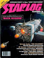
Robert McCall's "Buck Rogers"
 I found a couple of sites that document Robert McCall's involvement with the new Buck Rogers TV show in the early 80s. The "look" of his designs are very different from what was then the "look" of spacecraft on film. It should be noted that the original concept of the show was somewhat different from the initial version of Buck Rogers, at least for the first season. Instead of Buck constantly battling the forces of the alien Kane or some other space megalomaniac, he was instead to be part of an exploratory mission tied to a large mother ship scouting about the galaxy. I guess one shouldn't be surprised then that that is exactly what the second season of Buck Rogers more closely resembled. The illustrations were originally published in Starlog magazine while the concept was being developed.
 |
| Constitution (right) and the Leif Erickson (as UFO mystery ship, on left) |
Perhaps the dated aspect is in that the designs are actually rather curvy and relatively smooth, not filled with tons of greeblies as sci-fi ships at the time (and still are). At the same time they do have pointy bits like fins, antennas or landing gear jutting out. If they had been adopted it would have been different from many of the kitbashed designs that were on television at the time (I always hated recognizing on spaceships bits and pieces of something on my model shelf). Designs like these would currently be seen as "retro" I suppose. At any rate these designs did not find their way into the show and were really just by his own admission (see"film sketcher" entry for 2/12/12) a few quick sketches that were requested based on a story pitch. McCall was never hired on during production.
More information about this artwork is detailed at Christopher Mill's Space 1970 blog article which details much of the original concept for the show. The development of McCall's concept art is detailed at the Film Sketchr concept art blog article. There's also a brief pair of entries on this at MyDelineatedLife.blogspot.com (Thom Buchanan's art blog); part 1 & part 2.
In the end, the hero fighter in the show was the result of a discarded design of Ralph McQuarrie's for the Battlestar Galactica Viper space fighter. I haven't found much other information on the origins of some of the rest of the fleet, although the physical model work was done at Universal Hartland, Universal effects house at the time. The look of spaceships on the show in the end was very similar to that of it's sister show "Battlestar Galactica" consisting of heavily kitbashed designs with lots of little fiddly bits tacked on (although occasionally odd designs would appear such as the shark fighter which was basically an orange shark with a rocket, rather neat).

