Odds and Ends from my brain and interests. Given that it is meant to be much like my old cartoon strip at the Lowell Connector, I suppose it is eponymous (I also like that it does make an oxymoron of sorts)

If there is to be anything here of any regularity it should be about sci-fi, computers, technology, and scale modeling with origami thrown in on the side (at least not infrequently). Oh, I would also expect some cartooning too

Monday, April 08, 2013

Mod Mon: Creating Bulkheads from 3D model (II)

Part 2 of working with Blender to generate bulkheads

The last posting (Part 1) I wrote about creating a solid model from a 3 view that had relatively detailed outlines of loft lines on a ship's hull. Again, since the purpose of the example is to show how I did it, the model is not exactly what I would call particularly accurate. If I was to work on this for a finished version I would probably work it into a few subsections with a higher polygon count for each. Still, this should be good for now. As a reminder, this is done specifically with a somewhat deprecated version of Blender, but it should probably apply with quite a few different 3d modeling software packages. Also, this is done with an eye for a card model, but it should work fairly well with paper or plastic card scratch building.

So you got the shell of the thing

We prepared the hull in the previous posting, so how would one generate the bulkheads to provide the structure for the model. It's at this point that I would start making separate files. Why? Well, this part will be somewhat destructive. This may be particular to my software set up. I've been using Blender for some time, but I'm not a Blender guru (particularly since they keep changing detail bits, which is why I haven't upgraded yet). I'm using a paper model script that allows one to take a 3d model and cut it up and "unfold" until the pieces are flat, like flattening a box for recycling. The ability to generate this easily is limited by the complexity of the model.

If you read some previous postings I have made on using this script, you will read about some of the problems. Sometimes complicated internal corners, such as the ones created by bulkhead spaces, can create problems. This doesn't mean it happens all the time. Sometimes it works just fine with everything in one file of objects, but other times...well it's not so good. As a result I often have a structural file for bulkheads and such and a hull file. The important thing is that if you do this, the common points must match, otherwise trouble will ensue. I sometimes insure this by importing the hull file into a structural file as an external object so I can still see it. That is somewhat advanced and I won't go into it as it involves more complicated object relationships (Yes, true Blender people will gripe that this is a bit of a bearskins and stone approach, but it works for this purpose).

So, at this stage I'll save the hull, and then save the file as "hullStructure" to start working on the internals.

Carving out the Structure


The process is similar to what went before with the hull creation. Before we created a large rectangular block to carve our shape out. In this case we want to outline the interior shapes to the existing solid. First I'm going to start the outline of the top deck. This will follow the second line from the top. Since the model is symmetrical, I'm not going to worry about generating internal spaces for the whole ship, but rather just the port side. So for starters, I selected all the vertices along the port edge of the hull.
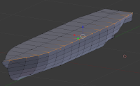
These I deleted to make the next steps clearer.
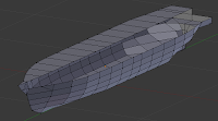

I followed this up by starting a longitudinal bulkhead along the centerline, starting at the front.
Taking the first cross section, I dropped a line from the center down by selecting the center point on the first section and then the one located directly below it (Blender "f" + 2 vertices creates a line segment).
This segment was subdivided, and the midpoint was adjusted as necessary to be co-linear with the deck height (Blender "g+z"). When done, selecting the three points at this level (Blender "f" + 3|4 vertices creates a face), the first top deck section was created.
The process was repeated dropping a line down from the next section, but this time it was subdivided, then subdivided on the segment below allowing a potential for a waterline section. These middle points were adjusted to the right heights. Faces were then created by selecting the co-planar points and doing a make face operation ("f").
At this point there are also enough points to start making the vertical structure. Selecting line segments it is possible to start building faces along the centerline (Blender can generally make a face with any 2 line segments as they have 4 vertices, or 3 if one is shared). These are shown highlighted on this image (Note that at this point extraneous line segments were deleted)
In a similar fashion, vertical bulkheads that shape out the hull can also be created
The rest of the centerline structure was created by dropping lines down, and then selecting each line segment to create a face (In Blender, as mentioned, any two lines, will create a face with 4 or 3 points). NOTE: If they are seriously not co-planar, Blender might balk, but the paper model unfolder will definitely not work.
You can see the end result from repeating the process of creating faces from the existing points once the center vertical faces and deck levels are set. On the right with the remains of the hull, and then on the left after the remaining hull is taken out. Since bulkheads should align with axial views (front/back, top/bottom, left, right), you can easily check by using those views to see the planes lines up (in Blender, keys 7, 1, 3, in ortho-graphic view [toggle 5 between ortho/perspective])
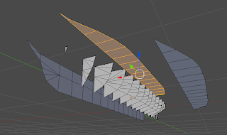
At this point the bulkheads are done. You could add seams and let the unfolder script make these parts, but you will probably end up with a lot of little pieces as the points were bulkheads intersect will be considered seams. On the other hand, you might get a better result if you explode the parts yourself. In theory, you don't need the unfolder script to do any real work since bulkheads are already flat. Here I selected the pertinent faces and then performed a "split" operation (In Blender "y" key) which "splits" common vertices creating a separate object. This I then moved away from the rest. I did this first for the vertical spine, then the two horizontal decks, which left just the cross-section bulkheads all by themselves.


And that's basically it. At this point you can use the paper model export function in Blender to have it crank out the shapes which should come out as one piece. You may need to put seams on the long pieces (a blender operation since it is also used for defining texture skins for the model) to force breaks since depending on the scale you finally export the file (a setting on the export paper model script) they would probably not fit on a single letter or A4 sheet.

Hope this posting helps with anyone trying to create structures for their models using 3d software.

Monday, April 01, 2013

Mod Mon: a Blender Hull for Bulkhead Generation

This posting is meant to be a detailed answer to a question posted on the StarshipModeler Forum on how to generate cross section bulkheads from plan drawings,  presumably orthogonal views with detail cross section lines. While the forum post was for plastic models, and this process is generally for paper, the process is transferable to plastic card scratch building.

To create an example I looked for a publicly available set of plans that show cross section lines. An adequate one was found for a prototypical design for an 19th century Arctic exploration vessel of the US Navy at www.history.navy.mil which was associated with the ill fated Jeanette Arctic Expedition, although it appears to not represent the Jeanette itself.

The software used was Blender 2.5x, which is admittedly old, but I'll try to  keep the description general so it would be applicable to any 3d modeling software.  The features that are used most often are:
  • insertion of primitive objects, 
  • selecting faces, lines, or vertices
  • creation of lines and faces from selected vertices or lines
  • scaling, both objects and selected vertices, particularly along a single axis (such as scale in X direction only)
  • Merging vertices and extrusion of vertices, lines and faces from existing ones, particularly along a single axis.
  • View frames set to either top/bottom, left/right, front/back

Step1: Get the Views in the right place:


I took the original sketch (and it is really just a sketch) and generated a good set of orthogonal views by correcting the slight tilt in the original and creating a reasonably clear front and stern elevation. This was done with "gimp"(GNU image manipulation program), but any image manipulation software, such as Photoshop, should be able to do this. The sketch had no top view, but that was ok as what we are really concerned here is the general hull shape from the top deck down. The file was saved as a png file. Again, the purpose of this exercise was to illustrate a process and not generate a real model, so this sketch is not super accurate. Of course on the other hand, I hardly ever work with views that have any sort of sectional lines at all, so this should be interesting.

     This version of Blender allows one to add various types of images to the blender files as a "background image" property. Most 3d viewing systems allow this in some manner, shape or form. In Blender these may be visible only in particular orthogonal views. I've seen image captures of other systems that allow you to set it at the origin so that it is also visible in multiple angle views. (aside: Blender allows visibility of one image in all orthogonal views, but this is only practical if the object is symmetrical in all axis, like a sphere, or perhaps if some of the views will not be  used such as the radial symmetry of a rocket body).
     Blender allows you to center and scale the image to your liking in the viewport. If you are going to use separate views (top/left/front), it is important to pick a particular point of the plan to be at the origin (0,0,0) to maintain consistency. An annoying aspect to this in Blender is that the background image is not optically at the same point so to speak, meaning that even though you use a set of images that are scaled equally, when in the viewport, the actual scale set may not match. This was the case in this project. Often you will not be able to get the plan scaled correctly until you have defined the parameters of the 3d model, so you many initially only work from one view, then check and size the views accordingly.
     In this case this happened to me. I initially set the origin at the bottom of frame 70 for left/right views - no problem. Then I set front and back, and it turned out ok for scale as well. I worked most of the process described next with just these views, but when I switched to "bottom" view, well the image was much too small, and to match the loft lines I had to scale it up a tad. Another annoying problem with Blender is that well, it's got it's axis screwed up in that it puts "front" in back and "back" in front (at least if I'm following a left hand rule), so I did have to remember to swap the views (It probably has to do with some drafting rule).

Step 2: Insert a primitive to sculpt

One can use any number of primitives to generate the basic shape of the hull, but the most logical thing is to use something that can easily approximate your target shape. In this case, a cylinder or a cube would probably be good. I picked a cube as it would allow me to start off  with few edges and vertices and add as needed. It is also closer to the traditional method of hull building from a block of balsa.

The cube was placed and scaled to the sketch on one of the views. I am starting from the starboard view. The cube then needed to be stretched to the appropriate length. This can be done by selecting the forward and back face and move it along the y axis (in Blender, select face, g, y) until you get it to the desired length. Note, I didn't take it all the way to the end, this was done just to avoid several merge points as the ends of hulls tend to be pointy.


Step 3: Shaping the object


The hull is bilaterally symetrical, so I set up a new edge that would split the object down the middle.
First I selected an edge that goes across the shape. Then I selected the "edge ring", namely the other "parallel" edges around the object. 
Aside: In Blender this is a possible selection operation once an edge is selected. The word parallel is quoted because in truth it isn't parallel lines being selected but co-lateral segments. If this where a sphere, it would select the segments along a particular cross-section. Once shapes become more complicated the actual path of the ring might be less clearly defined and no longer ring like

With the edges selected, I can carry out a subdivide operation on them. These will neatly add a vertex to the exact middle of each line segment effectively spliting the rectangular prism into two equal halves. Each half represents the starboard and port half respectively

Select one of the vertical edges on the faces and select the ring. Carrying out a subdivision will then result in an equatorial line.

Select this equatorial line and lift up or down to match one of your draft lines in the side views
The quick way is to select one segment then select the "loop" of segments which selects the collinear segments to that line. In Blender, once selected you can use the "g"+"z" keys to command move selected along z axis.
Repeating the process selecting the lateral ring will generate all the horizontal sections in the plan
Each cross section may have to be moved in a similar way, by first selecting the cross-section loop and moving solely along the y axis in this case.
The block should now be sectioned to match the sketch. A couple of things I didn't do was stretch to cover the prow or the fantail. I'll do these two bits differently.
At this point I'm ready to pull the block closer to the shape I want. Starting at the front, there's a couple of options. One would be to extrude the prow. The other shown below is simply start pulling out the front center line to match.
I selected the top center vertex at the front and pulled it out to match the sketch (g+y). This generated some distorted faces so I subsequently  subdivided some line segments and then cleaned up a bit by getting rid of edges (x in blender) then adding some new edges (f in blender).

I selected the next center point immediately below and pulled it out similarly. The special case here was selecting some edges to create a new cross section through subdivision, and then pulling the vertices to get everything to match.
An important feature of must 3D programs is the ability to get vertices to line up along an axis or slope. Since the alignmnets here were simple I simply made sure that the cartisian coordinates of co-axial points lined up. Also by setting up the centerline along the origin, mirrored points can be set up to be at the same but negative cartisian coordinates.


Repeating the process of pulling the center points I eventually approximate the forward edge of the prow
Shaping the sides now requires selecting a pair of mirrored vertices along a co-linear axis (this case x) to match the drawing for that cross section (Blender select points then "s" "x")Repeating the process for the rest of the points, I eventually arrive at the rough shape of the prow.

Moving down the cross section starts to create the shape.
These points set up an unique, but not unusual situation, that is that all three should be merged together. In Blender I select these three points. Then alt-m selects "merge" which in this case was the last selected, this being the center point of the three. (Note: I didn't repeat this for the other sections instead I placed the ends .1" off the center-line...see detail bottom view)

More or less this way the forward hull is generated. The limit is in that to shape the rear you need to see the rear elevation. Note that while doing this I alternated between solid view (shown here) and wireframe which allows you to see the background image. This will make working with the rear trickier since in wireframe view the front will be seen and particularly when in non-perspective view, which vertex you are looking at can be confusing. Switching between solid and wireframe to check your selection will be important.

The fan tail was done slightly differently than the bow, in that instead I extruded that deck from the back frame. This was done by choosing the face that makes up the point adjacent to the fan tail. The "extrude" operation was chosen (Blender e) specifically along the y axis (+'y' key, otherwise it may extrudes along a normal to face), and pulled to match sketch. Following this, mirrored points are manipulated in much the same way as before to shape the stern section
The fantail required some additional clean up as the faces were severely distorted and curved. I deleted some edges and reconnected some lines creating a new set of faces that follow the contour of the hull better.

The center frames needed to blend the stern with the bow, and it simply required matching the coordinates along the co-linear y axis points at the edges of the hull. This was done by selecting the affected points and matching the x coordinates (z having been set when they cross-section was lifted to match the right height already).


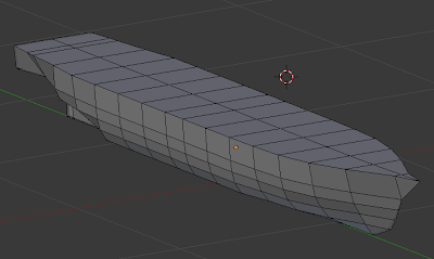
The end result is the more or less finished hull. Less so because many of these 4 sided faces are not flat, and as a result cannot be "flattened" into a shape transferable to a paper model or subsequent plastic card template, although it may be ok for 3d printing hardware. For cgi, well, there are just too few faces here, but trust me, you want to keep this number low for generating paper kits. Creating flat faces requires changing affected faces into triangles (quad to tri operation in Blender, ctrl+t). By definition, triangles are flat so they will not create a problem. I'm not going to detail that bit just yet since our main objective is creating bulkheads, but since this has been pretty time consuming, I'll leave that to a part II posting.

Coming next: Part 2, making bulkheads

Friday, February 15, 2013

Roots of SF/F design - Arisia 2013

After the Con

Well, I'm back from Arisia 2013. Alas, when the final schedule came out there was not paper modeling workshop so maybe next year. I did get to go one a panel that was lots of fun, the topic being the roots of SF/F design. The idea has been bubbling around in the brainstorm forum I think for a couple of years now.  The fundamental point is that there is a look for these things. Visually speaking, there is design style for the portrayal of fantasy art, often reflecting art noveau, celtic, or pre-raphaelite aesthetics. Similarly the portrayal of the future often follows certain aesthetics, although these are more closely tied to contemporary aesthetics in modernist (or post-modernist) design.
     The moderator for the panel was Frank Wu who was ebullient at various times as we hit imagery and topics near and dear to his heart (and, I have to grudgingly admit, perhaps overly indulged me -  Sorry). Also on the panel were the artists Thomas Nackid and Mercy E. Van Vlack.

What was covered

The Arts and Crafts movement is in some ways the mother to all. At the fantasy end, the arts and crafts movement looked to older traditions dating back to the middle ages for design patterns such as Celtic traditions and folk art. This was a reaction to then contemporary mass produced consumer products which were created without style or aesthetic, but only with an eye to efficiency. As such, the movement was opposed to machine manufacturing and mass production. It embraced the craftsman as the source of well made products. It also embraced a kind of honesty in material. There is, in a sense, a reflection of the material and an acceptance of what is an artistic decorative interpretation of the subject, not the subject itself. Curiously this abstraction is not that dissimilar to the more dramatic abstractions of the early 20th century. The abstraction of forms and patterns leads to an appreciation of the lines of these structures as a design pattern itself and is reflected in the more austere forms of the late arts and crafts period seen in the works of architects such as Charles Rennie McKintosh and Frank Lloyd Wright.
Aelita: Queen of Mars
      Futurism was discussed next and its relative Constructivism (which I still feel is aesthetically very similar if politically rather contrary). Here the references to SF come in some of the first films such as Aelita and Metropolis.

      Art Deco which has its roots in the developments of the Arts and Crafts as well as Art Noveau movements as we entered the 20s. The name itself is derivative from the Arts and Decorative Arts Exposition of Paris in 1925. Unlike the older movements it embraced the industrial age and new materials and techniques such as plastic.

"Just Imagine" rocketship
     Of course, the style most apparent from this movement in science fiction was "Streamline Moderne" which focused everything into capturing speed and movement, something that was a key aspect of the earlier work by futurists and constructivists as well as cubists. Designers Raymond Loewy and Norman Bel Geddes are remembered as some of the most influential designers of this period.

Post War

The International Style which would become the dominant design style of what was considered "modern" after the war has its roots in the Bauhaus design school styles of the 1920s. After Bauhaus was closed by the Nazis and its faculty dispersed,  staff and alumni were not surprisingly in a position to highly influence design in the United States and Europe after the war. Curiously, it is a style that is not the most dominant outside of a few movies and popular science imagery. We speculated as to the why, but nothing conclusive could be said outside of the fact that the very ubiquity of the style made it somehow insufficiently foreign to be a "futuristic" style for speculative imagery.

The view of the future, at least in the United States seems to have been captured by what is called Googie architecture (just love that name). Googie was an outgrowth of Streamline Moderne, or streamlining on steroids. The name comes from a now non-existent coffee shop in LA, but it is epitomized by the look of some of the more outlandish architecture in LA and Miami. For those who still don't know, it is the look of The Jetsons. Curiously, similar looking structures done in "Post-Modernist" styles such as the TWA terminal at JFK, or Brasilia are not termed "Googie" as a rule, but the aesthetic seems very similar, if more subdued. Pictures of Le Corbusier's church at Ronchamp seems to encapsulate the key Googie elements of the chevron and the slanted roof.

Is there still a look?

That's an interesting question. In researching this topic I noted that there is generally not a "futuristic" look to contemporary SF since Star Trek really. Much of the imagery keeps a lot of the common design elements of everyday life or look for a style that is part of an iconic cultural niche such as the film noir look of Gattaca. An example of this "non-futuristic" future is "AI", which while containing futuristic imagery, seems comfortable in presenting a good deal of the future as a really nice contemporary suburb.

Material for the future

I don't know if Arisia would be willing to revisit the topic next year,  although my wife thinks we would have gotten more people if we had not coincided with Roger Dean's art tour. I would love to do this again with a little more time spent on the fantasy end of design. Actually I think there is material in exploring the apparent dichotomy of organic styles such as Art Noveau for fantasy and the more austere Bauhaus or Atom Punk Googie style science fiction.  It's as if fantasy is organic, biological, hands-on, and meditative, whereas SF is more mechanical, manufactured, and pasteurized.

The other thing that I think would be worthwhile is looking at how World Fairs and International Expositions really shaped what the popular vision of the future would be like. This may go back as far as H.G. Wells vision of a city under glass from memories of the Great London Exposition and the Crystal Palace, but there are also the famous Futurama halls of the New York Expos of '38 and '64.

Refs

     I have re-edited this post soon to update links and imagery, but since back from Boskone and South America (another story). Here is a link to the PDF of the slides that I used for this panel. As a general rule, Wikipedia is still a great starting point for any of these things.

     Some things I looked into that provided information about the Paris exposition of 1925 are now on the www archive (http://web.archive.org/web/*/http://www.retropolis.net/exposition/), but sometimes missed is Frederick Kiesler's City in Space installation which does seem to presage the look of the International modernist style that would predominate the post-war world. Basically, not everything there was art deco.

     As I mentioned, World Expos are a big part of the look of the future. The ExpoMuseum provides a certain amount of information on many of these exhibitions.

     Some additional links would be David Szondy's "Tales of Future Past" as well as detailed information on the design look of "Space 1999" at www.space1999.net sollarium (link dead at time of posting, will have to see if it comes back). There's also a lengthy article at Wordpress on Kubrick's 2001 design style: Designing the Future.