Odds and Ends from my brain and interests. Given that it is meant to be much like my old cartoon strip at the Lowell Connector, I suppose it is eponymous (I also like that it does make an oxymoron of sorts)

If there is to be anything here of any regularity it should be about sci-fi, computers, technology, and scale modeling with origami thrown in on the side (at least not infrequently). Oh, I would also expect some cartooning too

Monday, December 22, 2014

Flying 'Round: real saucers (sort of) - Part 1

A look at some real saucer and roundish aircraft

I recently picked up a book on weird aircraft at the bargain bin. The book could use some serious editing, but it did go over a variety of interesting designs that are not often mentioned in aviation books - often with good reason. Many of these I have also seen around the web, particularly since I'm fascinated with designs that didn't go anywhere. There was also a comment on one of my blogs about a real saucer that I decided to follow up on (the comment is on the wrong page somehow as it should really be part of the "Saucerfull" post, but anyway.) It is an interesting story, but nevertheless not that unique in aviation history, that is the idea of a flying disk. It is also an idea that predates the classic flying saucer story from 1947.

The more I prepared this post, the bigger it got, so I'm going to break this into separate parts to make it easier to digest (particularly for me).


What is a round wing?

There is some variation into what may be considered a round wing. One could say that it is of a circular wing planform (looking from top down) or a flat ring like (circular) wing planform. Disk wings are also described as low aspect ratio wings, meaning that the width of the wing (the chord) is large when compared to the wing's length. The surprising benefit of this type of arrangement is that it provides a considerable amount of lift at low speeds and high angle of attack (the angle of the wings with respect to the airflow). As a result these aircraft could fly at very low speeds and were attractive designs in the era pre-dating helicopters.
     Another type of round shaped wing comes from annular wing design. In this case the wing is encircles the fuselage. It is sometimes flattened out and made boxier for a shape that resembles a stretched box kite. This general design is also referred to as a closed wing design.
     A variation of round shaped flying machines is perhaps closer to what we would think of as a flying saucer. In a sense, these are wingless, because while the shape is generally considered to generate a certain amount of lift in flight, the main aspect of the shape is to house primary lifting devices that operate symmetrically. The more traditional lift devices make use of exhaust jets or ducted fans of some sort to redirect a mass of air directly downwards to counteract gravity. A more sophisticated method makes use of the Coanda effect to create an area of low pressure over the surface to lift the craft. More esoteric methods described are sometimes more whimsical than practical, such as electromagnetic levitation. One practical method that has been investigated is the usage of the shape as an energy receiver in the form of microwave or laser energy which can then be used or focused to superheat air at the base of the disc to generate thrust.

 Flying Pans and Pancakes

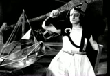
DaVinci's Helicopter
The prototypical flying saucer?
It is recalled that 19th century Yale students indulged in the aerodynamics of flying disks as they threw either the empty pie platters or cookie (can?) lids embossed with the name of the baking company; the Frisbie Pie Company of New Haven, CT. The shape of the these plates imparted some lift, but spinning it gave it the stability to maintain a positive flight attitude through its flight. While there are some images of spinning circular wings, the mechanics of spinning a wing simply to impart stability seems not to have been thought the best way to achieve that result (exception being Guido Fallei's design on the cover of the Sept. 1930 Popular Mechanics?). On the other hand, some inventors looked at the possible added strength from wider or ring like wings as a possible solution of building wings with enough lift area to heave up their weight and not collapse at the same time. The thing to remember is that in the early history of practical manned flight (and particularly pre-flight), there was generally a poor understanding of the mechanics and forces involved in flight, so in truth when some of these designs proved effective it was perhaps more a matter of luck than actual thoughtful, researched, design. The British aviation pioneer George Cayley achieved some success making small gliders with large kite shaped wings which were rather long in chord and narrow in span. Along these lines other 19th century inventors created saucer like designs such as John Wootton and Alphonse Pénaud, (1850 - 1880).

George Cayley's early gliders featured kite-like wings in various configurations (bi-planes and triplanes). One design for a helicopter featured saucer-like rotors. John Wootton patented a flying machine that operated like a helicopter and featured a large fixed circular parachute wing for safety. Alphonse Penaud designed a very modern looking flying machine with a large oval wing with engineer Gauchot in 1874. This last design was refined by 1876 with many modern features such as retractable landing gear and automatic controls. Penaud built many models that featured his forward concepts, but was never able to get financing to build a full sized version of his design.

     The advent of actual flying machines did not initially discourage inventors from trying unique and imaginative variations on flying machines. This was due in part to the availability of the resources in lightweight materials and powerplants that finally made these plans viable. There was also a lack of specific knowledge of aerodynamics that might have been used to better analyze these aircraft. It has also been noted that the Wright brother's aggressive protection of their patents did encourage investors to find "different" ways of flying. Louis Bleriot and Gabriel Voisin for instance working in Europe had very sketchy information about the Wright's success (in fact many in Europe doubted they had really flown at all). They chose an annular design for their biplane creating a sturdy structure for their floatplane. In the end, the design did not work and after some modification both designers went their separate, but ultimately successful, ways.
The Bleriot III used an annular or closed wing shape. It was eventually abandoned. The MCormick-Ronne circular aircraft did manage to fly eventually around 1912, but also proved a dead end. The Lee-Richards design of 1913 was a development from the earlier biplane design.
The McCormick-Ronne "Umbrella Plane" or "Cycloplane" had an interesting development history. Originally based on designs by William Romme, it received funding from Harold McCormick of farming machinery fame, and the millionaire John D. Rockefeller Jr. starting in 1910. The aircraft's basic design made use of a wing roughly in the shape of a regular polygon, held on a set of radially distributed spokes which in turn were supported by a large centrally mounted mast. Other aspects of the craft changed with time, such as the position of the controls, and the propeller and engine assembly which was variously either pusher, puller, and sometimes connected to the engine by a long shaft. At some point Charles Vought worked on the project as a young engineering graduate. Vought would later found a company that would revisit the "round" airplane concept. In the end the Umbrella Plane proved to be a dead end and was apparently abandoned around 1913.
     The J.G.A. Kitchen, G. T. Richards, and Cedric Lee designed aircraft that used a circular wing planform. Initially Kitchen created a circular biplane which was refined with Richard's help. Disagreement between the designers resulted in subsequent work being developed by Richards with Lee. The Richard Lee Monoplane went through various versions (1,2,3) from 1912 up to 1914. The final version crashed with Lee at the controls, who managed to escape with minor injuries, but the aircraft was a total wreck.
    Stephen Nemeth's, another "Umbrella Plane" built in 1934, mounted a circular wing above a standard fuselage looking like some of over-sized parasol and hence the name. It could take off and land in very short spaces due to that low aspect ratio wing. The circular wing was also only 15 feet in diameter making it easy to store in a hanger "not much larger than the ordinary garage" as the Modern Mechanics of June 1934 noted.

The Nemeth "Umbrella Plane" of 1934. If you can find newsreels of it, it flies surprisingly like a gyrocopter
Some of the more notable aircraft of this type were developed by C.L. Snyder, a podiatrist. He noted the interesting gliding properties of heel lifts and decided to try creating an aircraft around that shape. He did indeed employ actual aviation engineers in his company, the Arup Manufacturing Co.,  so the wing design was not totally based on an artifact of shoe manufacturing. Still, you can see the heel in the designs. It was developed through several models, Arup S-1 thru S-4 and even one off-shoot created by a former Arup engineer Raoul Hoffman who designed the similar Hoffman Flying Wing.
     All these aircraft show remarkable STOL flight characteristics and unique flying characteristics such as maneuvering at slow speeds. In fact newsreels of the craft show them taking off with very little space and practically dropping straight down for landings with rolls of only a few feet. The claim that it could take off and land from your own backyard does not look far fetched.

Strangely enough, the Nemeth and Arup aircraft did not really capture the interest of manufacturers that could have marketed and mass produced the aircraft. Perhaps it was the result of the fairly specific performance envelope at the time. They were also not the only ones to create such designs, the moth-like Aubron-Payen AP-10 being an example. While these aircraft did exhibit remarkable STOL (Short Take Off & Landing) capabilities, they were not that unique for a world dominated by relatively slow, fast climbing biplanes that could operate from small unpaved fields. The contemporary autogyro (precursor to helicopters) could match that performance and even show limited vertical take off capacity. More effectively marketed by Cierva (the inventor) and Pitcairn, autogyros were not limited to one-off prototypes.

World War II

     The U.S. Navy has a strong interest in aircraft that could easily take off and land in short spaces. They considered a design proposed by Charles H. Zimmerman from Chance-Vought. Zimmerman reportedly visited the Arup Company and investigated using the combined effect of the disk-like wing with air blown at high speed from the propellers to enhance lift. Test models of the design were shown to rise practically vertically with good control. Moreover, the design could potentially have fighter-like performance. The prototype V-173 was flown several times and showed much promise. The fighter prototype was the Chance-Vought XF5U-1. It's development was protracted and not completed by the end of the war. After the war it was undergoing engine tests prior to flight tests when the program was canceled. It was a victim of the jet age, as most cutting edge propeller designs were at the end of World War II.
     When talking about World War II saucer aircraft, some mention must be made of Nazi projects. It is true that several strange and unusual aircraft designs were produced by German aircraft designers during the war. It is also true that even stranger, futuristic designs were still on the drawing boards (or actually just left there) at the war's end. They had developed rocket and jet technology to the limits of engineering capacities at the time and in many ways were considerably more advanced than what the Allies had developed by that time. Even so, the stories of highly advanced "flying saucer" designs based on advanced electromagnetic devices or supersonic turbines have to be taken with a relatively large sized grain of salt.
     One of the few documented German "saucers" was fairly conventional and along the lines of Arup and Zimmerman. The Sack AS-6, had a truly circular planform. It was powered by a small engine and in that form would have been limited to simple utility work such as reconnaissance or field courier. Beyond research into that type of wing,  nothing really came from that design.
Various World War II era "round" aircraft (*design only, ** not flown). The Payen 112 (based on the PA-22 racer) was not round, but was perhaps an introduction of low-aspect ratio wings in the presently more familiar delta wing. Of these only the Eshelman Flying Flounder, the Vought V-173, and the Sack AS-6 actually flew. The XF5U was cancelled before flight, whereas the Boeing 390 and FW-Rochen were never built

     Other designs appear to be nothing more than quick paper studies: the Focke-Wulf Rochen that would have hidden a lift fan inside it's teardrop shaped lifting body fuselage, and the Heinkel Wespe and Lerche II designs which were tail-sitters with annular wings. It is doubtful that there was any way these technologically advanced craft could go much beyond theoretical work at the time. After the war much of this information fell into Allied hands, and truth be told, many of these designs proved impractical even with the huge military research budgets of the Cold War. As far as anything else, I really don't want to delve into some of the crazier rumors out there.

Next time:  More human flying saucers...

Links and Resources for Part I

There is of course many areas on the Internet to find out about flying saucers, real and imaginary. Unfortunately, due to their connection to alien technology, they can be pretty odd. In the case of the speculative human saucers, they can also be rather odd (particularly the Nazi ones, which seem to be in a mythological class by themselves). If one can overlook some of the personal points of some of these sites one can find out quite a bit on the real designs. The grain of salt comes when looking at designs that may have been nothing more than a sketch on a piece of paper by people with little aeronautical expertise that's been lost for decades.

Friday, October 03, 2014

Rounding out flat paper

Some observations on problem surfaces

One of the biggest problems with paper models is the fact that you can't really curve paper in two different directions at one time. I should actually qualify that statement that you can't do that severely or easily in two directions at one time. The other problem is that many 3 dimensional surfaces are not directly mappable to a 2 dimensional space. This second problem is easily illustrated by taking a large section of orange peel and flattening out on a surface. The peel will inevitably crack and split.

Getting paper to go around in more than one direction

The reason for the former has to do with the material itself. Paper is a mesh of microscopic fibers (typically wood pulp) that are woven together under pressure. There is often a general alignment of these fibers that result in the paper being easier to roll in one direction rather than another. Some model designers actually recommend taking advantage of this property when fitting pieces for printing to take advantage of this natural roll which in most factory milled paper would be around its long axis. A crease or fold in the paper actually breaks some of these fibers creating a hard corner, but a roll will simply bend and stretch the fibers into a curve much like the way you would cup your fingers to give someone a "leg up" somewhere. While in theory it should be possible to stretch and bend those fibers around in more than one direction, like the way fabric will stretch and wrap, in practice paper fibers are too static.
     A limited amount of orthogonal roll (that is rolling around 2 axis) can be done by rubbing the paper over a curved surface such as the outside of a large spoon bowl. This technique is unfortunately limited to small areas and curvatures that are relatively shallow. If the paper is damp, it can be molded to some extent, of course if the paper is printed in a water soluble ink, this is not an option. Don't expect very dramatic curves, but it might be OK for miniature dishes and the like.

A sheet of paper is Euclidean

If you try to wrap paper around an apple to match the curve you will quickly come to the reason for the second problem. When one is first introduced to geometry, one of the first tasks is to draw a typical flat X/Y (Cartesian) coordinate system. Parallel lines will always remain equidistant to each other. This is a geometry whose properties were initially described by Euclid, and so hence Euclidean. On a non-Euclidean surface, by definition this is not true. So two parallel lines, being lines who can share a normal (a right angle intersection), do not actually remain equidistant. The classic example are longitude lines which while parallel at any particular latitude, in that they meet the common latitude at right angles, they do actually meet at the poles. This critically means that the area covered by any section between these two lines is not constant. This is why the orange peel splits, since there isn't enough area of peel to compensate for the increase in space as you try to map non-euclidean parallel lines to a flat euclidean space. The inverse with paper is the appearance of folds that try to take up the extra area.
     Surprisingly, not all 3D surfaces result in this type of area difficulties. Consider the rolling of a sheet of paper into a cylinder. This is a 3D surface, and it is quite trivially mapped onto a planar sheet of paper. Similarly you can bunch it up in a cone shape and again, this is not a problem. It turns out that a cylinder is basically a subset of a cone section, that is a segment of a cone whose vertex lies at an infinite distance from this segment. For a trickier shape, consider rolling over two corners like a cone and hold the other corners flat on the table. This shape is still related to the cone, but contains a more complicated set of curvatures.

A standard flat sheet on far left, curled up into a cylinder, then roughly into a cone, and finally the pseudo hood like shape that is flat at one end and curled at the far end
     The ability to create relatively complex curves that are based on shapes that can be mapped onto a plane is discussed in an article downloadable from papermodelers.com (alas membership required) called "Cardboard Models Design Principles" by Mad44ms. The paper can actually be a tough read if one is not well experienced in 3D geometry and CAD software, but it does provide some insight into what can be done with flat paper and how to minimize the number of parts to make a curve. To create the examples, Mad44ms takes advantage of the software to maintain the plane-mapping qualities of the surface that is being worked. This is unfortunately not always an option since the ability to do this may not be part of your software or at least a feature that is not easily understood - 3D software is often very complex and the learning curve can be very steep.
     Still, the basic cylinder and cone can provide a variety of different surfaces to work with, even in cases that the cylinder or cone are sectioned and somewhat asymmetrical.

Cylinders and cones. Note that a tapered cylinder is just a cone cut off horizontally. Similarly a cone section can be cut at any angle and the resulting shape can be mapped to a plane. Even a cone where the vertex is offset can be mapped to a plane (and a section of that type of cone as well). See next figure
On left, a simple cone. Center, a cone with an off center vertex,. Right, tapered cylinder.
     Regarding exceptions, if you recall the rolled sheets, it can be possible to extend some shapes along a line which indicates a change in curvature. If the line is straight in 3D space between the faces they can be kept together. In practice, without software assistance to maintain the required constraints (matching slopes on both faces, etc), this isn't really possible.  A possible surface that can be done manually by visualizing denting a cone in, or adding a cone in from the opposite direction such that the slope of the intersecting line segments are exactly opposite. The easiest example is with centered cones in which case the common seam is centered and circular making a crater-like shape. There often isn't much call for this particular shape, but I've seen it used for creating fancy eyes on dinosaurs and dragons.
The particular crater-like surface on the right consists of two intersecting cones of exactly the same absolute slope (although one is negative the other positive). The flattened pattern can then be two concentric sections (right).  The inner seated inside the outer. In theory, when folded it automatically generates a perfect circular section (in practice it's somewhat hard to glue perfectly...oh well). 
The crater does not need to have equally long slopes on each side, it doesn't even really need to be centered. This last point is because it only requires for the absolute slopes to match at the point of intersection, but not that the slopes on the whole be equal (the flattened version of the such a shape would have the middle circular fold line off center). To see the range, make a paper cone and dent the apex in such that you get a smooth surface on both sides. Without software to help you get this right, only the centered one is easy: make a cone, then halfway up, subdivide, reset apex to same height as base, then set segment lengths to required lengths by subdivision or translating vertices along the line to keep the slopes unchanged..

Triangles...why I mentioned them

An unfolder script for SketchIt made use of the fact that any face can be flattened against another face along a common edge. This can be then be extended to the next face and so on. Some designs that use this algorithm can appear as long snakes or like some kind of angular octopus.
     While Blender does allow for polygons of pretty much any size, the paper folder software only likes faces that are co-planar, i.e. flat. If for some reason you stretch them unevenly or apply a change to any individual vertex, you may very well introduce a twist in the face. This is also true if you make new 4 vertex faces on your own. When this happens in Blender, it is easy to find non-flat faces as the unfolder script will highlight them (although the feature can be buggy). A better method to deal with this is converting suspect faces, or even whole suspect sections, to triangles. Converting triangles not only guarantees flatness (3 points define a plane), you can also control the type of twist the surface gets for your purpose, such as a more complementary curve to the shape itself.
     Now when looking at a set of adjacent triangular surfaces, you can conceive a part that consists of the entire path of adjacent sides. You can also continue the path outward on additional sides provided that they only meet the main part along only one adjacent side (Note: exceptions do exist). If the curvature reverses (say from concave to convex), you may have to separate the part the mapping might cause an overlap.

A nonsense pseudo vampire with flowing cape that can nonetheless be mapped onto a single sheet.  Simply follow the path of the triangular edges from left to right. The "head" is also attached to only one triangular edge and itself has appendages that are only hinged on one edge.

Concave and Convex and Overlaps

So some intricate shapes are possible, but there are limits. As seen, it is possible to accommodate surfaces that twist and present concave and convex surfaces. Objects with both concave and convex surfaces can create faces that when unfolded results in overlaps. Sometimes with careful planning, you can allow the parts to unfold in a manner that the parts will miss each other when unfolded. In the Blender unfolder script, this is not always caught and you end up with an unworkable part. When it is caught, the part might be cut off arbitrarily and placing it back where it belongs can be tricky.

This surface consist of a rolled surface with down angled sides. The colors refer to the particular parts that overlap when unfolded ; the overlap being shown as blended colors(bottom). In this case, this part would need to be cut into different parts (at least 3, center plus 2 outer panels)
    Unfortunately, I don't have a sufficiently mathematical background to address when this would happen based on the geometry involved. Some surfaces that go in and out can be resolved without a problem, others can't. On the other hand, you may be able to visualize the problem parts as you plan the path of the common seams. Unfold it mentally and you may see not only where the problem arises, but how you can unfold it differently and avoid the problem altogether. I'll talk about decisions regarding seams and patterns for parts in a future posting.

Nautilus ice breaking ram from ongoing project. The highlighted section is only made up of triangles with single common "hinge" segments. It should unfold as one part if so desired.


Friday, August 15, 2014

Fanciful Engineering and Frank Tinsley

The art of Frank Tinsley and Sci-Fact-Fic

Some time ago I participated at a panel on spaceships for artists at Arisia (see old post). One of the odd things I was surprised at was the lack of familiarity in the panel and others with Frank Tinsley, an illustrator who did quite a bit of work for pre-war pulps and Mechanix Illustrated magazine after the war. While many SF illustrators were famous for the SF pulp cover work they did, Mr. Tinsley did no particular work for the many science fiction pulps or paperbacks during his career that I can find. On the other hand, he did quite a bit of work in an area which doesn't really have an adequate description. I suppose it is an area normally referred to as futurism, but in some ways I  think the terms science factional fiction or science fiction engineering is closer, or even Futurama. I don't mean the TV show, but rather the hugely popular GM pavilion at the 1939 World's Fair designed by Norman Bel Geddes.


"To New Horizons" the GM industrial film to introduce their Futurama Exhibit at the New York's World Fair of 1939

The reason I believe in the difference is perhaps because futurism does cover a lot of work that is actually rigorously thought out and modeled with reasonably hard data regarding technological and social trends. The type of work I would consider under sci-fact-fi or S/F/E  covers the type of documentary work  that talks about subjects with an air of hard technical background or specificity that is really at best an excessively overly optimistic view of technological and social trends and at worst pure hyperbole.

In spite of that last sentence, I do believe there is a great deal of value to this type of work. Whilst on the one hand, it is not really useful as any sort of foundation for creating a real functional piece of technology or social engineering, I do suppose it has in the past served as much an inspiration for young future engineers as the appearance of technology in science fiction romances. In fact, such articles were perhaps even more inspiring since they were normally presented as a non-fiction subject sometimes in quite serious publications such as Life or National Geographic.
Life magazine speculative article illustrated by Robert McCall about the future of space travel that accompanied the "First Man in Space" issue April 21, 1961 (find original at Google Books)

Frank Tinsley


Frank Tinsley was born in 1899 in Manhattan. Turn of the century Manhattan was perhaps the living embodiment of a future city in its day. Already having some of the tallest buildings in the world, it was a hub of continent wide transportation arteries. It contained the largest and highest bridges in the world, an elevated and subterranean suburban transport system, and collected a truly polyglot community perhaps unequaled anywhere at the time. Perhaps more importantly he was born in someways along with aviation and it was the aviation pulps where he did a lot of covers.
Variety of covers and art work Frank Tinsley did for the Air Trails/Bill Barns pulp magazine
As dated as these covers may seem to us, they are drawn with an air of passion about flying machines, colorful and dynamic. I dare say much more exiting than even what comes out of the marketing department of Boeing/McD-D and Lockheed-Martin these days. Many of the aircraft shown in these covers and stories represented slight variations on existing aircraft or protototypes.Some of Bill Barnes aircraft were truly inventive designs with some rarely implemented features on real aircraft such as retractable floats and sky hooks for areal dockings.
Some of Tinsley's fanciful futuristic designs that accompanied his articles for Mechanix Illustrated. From top right: A suburban saucer, a nuclear airship, a walking jeep or mechanical mule, and an airborne hover police car.
After the war, Frank Tinsley also began to write articles of speculative engineering projects, S/F/E involving many different forms of transportation: space, terrestrial, and maritime. He also illustrated a memorable series of advertising for American Bosch Arma in the 50s. These ads featured various nuclear and solar powered spaceships and lunar bases with descriptive copy of the futuristic settings, although the company was not in the business of building or designing spacefaring hardware at the time (just their electronics). I still have fond memories of the ads having come across them in old Scientific American issues from the 50s.
Two of the American Bosch Arma Adverts

As prolific as he appears to be in this area of illustration, I can't find any mention of him connected to any actual science fiction magazines or covers at this time. Given the nature of his articles, I can only imagine that he must have been a fan

More on this


While his images are out there, and not always credited, there is very little about Frank Tinsley himself. A brief bio as available at The Field Guide to Wild American Pulp Artists: Frank Tinsley. Also some more information here at the Lambiek Comiclopedia. The Flikr user X-ray Delta One (Call sign for the "Discovery" if you didn't know) has a collection of his images including some of the text of some of his articles. The articles for Mechanix Illustrated are available at the Mechanix Illustrated blog (I've put the link off the search term here to hopefully make it faster to find). A gallery of the ABA ads can be found at Vintage Ads on LiveJournal.

Sunday, July 20, 2014

SFX: People Prefer Old School?

I've been very late getting back to this blog, and normally I always make at least one post after Arisia (2014) about something that happened there. This year there were at least two (probably more), but oh well, I'll get to at least one.

I ended up participating in couple of panels that dealt directly or tangentially with film. The first was actually regarding the looks and trends of current genre film, and the former tangentially in that it dealt specifically with design of fictional genre items. The topic that came up repeatedly though at this con (as well as similar panels at the subsequent Boskone 51 which I was able to attend this year) was the feeling that modern computer aided scenery and effects were not all that "good" and not up to the standards of much more classic FX done in older, particularly pre-CG days.

Some of this can be assigned to a lot of films which seem to revel in the extremely complex CG subjects that are animated up the wazoo, such as the Chitauri Leviathan from the "Avengers" movie or even the new Tranformers as visualized in their film appearances. These are not unique instances, but to some extent creates a kind of "what's with all the whirly bits" feel to it which perhaps to some extent detracts to how believable these objects are as "real" functional objects. Well, at least it does to me.
Wiggly Leviathan
The other and perhaps more pernicious problem is the usage of CG to create monumental sequences. These sequences used to require filming in some borderline Iron Curtain country so you could rent an army cheap to dress up in gear and charge across wheat fields or below a glass matte. The problem here is rather odd because programmers go through quite a bit of work to create realistic renders, and provide a certain amount of individual behavior through AI, and other variation in details that can easily exceed what you may get out of a set of mass produced props. Moreover, in situations where real life stunts would have been required, deadlier action can be more easily (and safely) visualized. This immense attention to detail, however, makes it obvious in the mind of a viewers that what they are seeing is of course fake.

On discussing the acknowledgment of Ray Harryhausen in the recent "Pacific Rim" credits,  a repeated remark was how much people preferred the artistry of his animation techniques. The artistry and talent required in many of the sequences involved in many of his films is undeniable, but is his animation technique comparable to even the early animations of dinosaurs seen in "Jurassic Park" which marked the first break away of stop motion for this type of movie.

The film short "Stop Motion vs. CGI as presented at the 2001 SIGGRAPH animation room (Will Vinton Studios). Details at the Inet Archive
Another aspect of old time effects that was commented about was the use of solid models as opposed to CGI in 2009's "Moon" directed by Duncan Jones. Jones used traditional miniatures as opposed to CGI to create the vehicles and exterior scenes in this movie. While this was done in the interest of the budget, Jones was also interested in capturing the look and feel of older space movies and programs such as those created by Gerry Anderson's programs (more on this below).

Pacific Rim

The context of much of the discussion I participated in was around the recent "Pacific Rim" and its clearly stated homage to Japanese kaiju genre film - i.e. the Japanese monster movie. This adds another aspect of "old timey" type effects, and that is "the man in the suit" to animate aliens and 60 foot monsters - the latter effect traditionally done though extensive use of scaled miniatures that are animated in real-time though motors and wires while interacting with a man or woman in costume. Guillermo del Toro, the film's director, made extensive use of CGI to create his kaiju, but expressly asked that all designs be able to theoretically fit a person inside them. The film also made use of some scaled miniature shots.

The film's jaegers, giant robots, pay homage to Japanese mecha genre. Mecha were also traditionally operated by a man inside when filmed as live action, but are perhaps more generally known from anime subjects such as Macross and Gundam. The mixture of monsters and robots is not unique either, as such battles were not unusual; even Godzilla and King Kong have battled their mechanical counterparts.
Godzilla vs. Mecha-Godzilla (1974) and King Kong Escapes (1967) Toho films.
Gerry Anderson's designs are also part of this design palette (that being directed by Derek Meddings special effects work for Anderson). Shows such as Stingray, Thunderbirds, Captain Scarlet, and U.F.O. featured realistically designed vehicles based at elaborately engineered bases, often underground. The elaborate mechanisms of boarding and launching ships is definitely echoed in the elaborate boarding and launch procedures for the jaegers in Pacific Rim.

Thunderbird 1 launch sequence from Gerry Anderson's Thunderbirds (1965-68). If you are a glutton for punishment, look for the Mars ship launch sequence in Thunderbirds are Go
It seemed to me at the time that the overwhelming positive reaction to the film in these panels had much do to the care with which the director and creative crew went to recreate the look and feel of these older movies. At the same time, there is no denying that a great deal of this work was only possible through the extensive use of computers for scene rendering, lighting effects, composing, color balance, and perhaps a slew of other visual details that were transparent to the audience.

Old vs. New

I have to admit there is a definite generation gap aspect to whether you like or dislike modern effects vs. old. In watching a recent documentary (ref below) there is repeated admiration for the artistry and talent of Ray Harryhausen and other stop motion animators, and yet is the work as "accurate" as a CGI rendition of similar subjects? Traditional stop motion animation, as well as matte or combined miniature shots, generally required fixed camera angles, and a limited set of those angles for the shot to work (unless the camera shots could be accurately computer controlled, see Magicam). The stroboscopic movement of the models was always hard to correct for, and there were always visual differences between small scale details between miniatures and combined live action were sometimes quite noticeable as being "off" (fur vs. hair for example just never worked 100%),

I think the mistake is to criticize these efforts as failures, but rather it is good to remark on their strengths. Even the "man in the suit" efforts and the usage of puppetry in effects could be remarkable for their time. A film that illustrates this type of effect quite successfully is Jim Henson's "The Dark Crystal" of 1982.

On the other hand, it is impossible to compare the original puppet Yoda to the much more detailed and nuanced Yoda of the second trilogy. While in still shots, both are very good, in movement, in spite of Frank Oz's talent, there is a bit of a giveaway - maybe if the audience didn't know beforehand?

As for miniature shots, as a model maker I certainly miss traditional models. For one thing, given their original solid existence, they were easier to recreate. Still, the multiplier effect of computing power allows new vehicles to be designed with a much higher level of detail than what was possible with traditional kitbashing. Moreover, whereas one may have done much with a collage of mixed parts (a bit of a sherman tank here, half a tractor engine, a section of a battleship deck, etc), CAD tools allows the design of a ship based on the original concept art illustrations directly and by the original concept designer. CAD tools even allow for the inside of the ship to actually fit inside the outside as designed! CG vehicles are accurate to themselves regardless of the scale of the shot or number of vehicles. This is as opposed to traditional models which would differ among themselves depending on whether it was for a long shot or a "hero model" to be used for a closeup. Traditional miniatures are also associated with other problems. Limits on possible shots due to issues of depth of field or the static nature of the occupants give away the scaled nature of objects. Miniatures, as in the case of stop motion miniatures mentioned earlier, have problems in that they can't scale their interaction to flame or water making such interaction appear "off", in spite of various photographic effects to minimize the problem.

There are so many things that computers have done to improve the appearance of fantastical ships, creatures, and environments as well as recreating scenes that would otherwise be impossibly expensive. True scale physics can also be integrated to the animation so objects and events can behave properly to the objects designed size and mass.  As a result, I cannot criticize their use in film and genre film in particular.

If there is fault, it is perhaps in the creators of these films that genuinely believe that more is more. One of the interesting things about looking at older movies is the focusing on the near as opposed to the grand, the individual as opposed to the epic. Perhaps more importantly, these creators need to know that epic visuals will not substitute for a missing plot, particularly as the tools for creating epic sequences are available pretty much to everybody (if you got to see the original version of "Star Wrecks: In the Pirkenning" it is impressive to think it was basically made in some guy's apartment). When everybody makes grandiose epics, are they still epic?

Perhaps sadder still, at least for old foggies such as myself, is that viewers no longer look at a special effects shot and wonder "how did they do that?" but instead just think the computer did this.

Stuff that's out there...

Netflix has a few rather interesting documentaries available on classic SF movies, namely a documentary on Ray Harryhausen, "Ray Harryhausen: Special Effects Titan" and "The Sci-Fi Boys" that also covers a lot of the classic creature effects and makeup. The "Making of the Godzilla Suit" covers the creation of the seminal kaiju in 1954. "The Making of the 21st Century" covers the puppet productions of Gerry Anderson in the 1960s (found it on youTube in 2 parts: Part 1, Part 2 ). For commentary on analog vs. digital, another Netflix documentary is "Side by Side", where we follow Keanu Reeves as the film looks into digital film making technology.

The argument of stop motion vs. CGI is discussed in Ethan Gilsdorf's article "Why Ray Harryhausen's stop-motion effects were more real than CGI" at boingboing.

DVD extras now provides ton of materials with regards to "behind the scenes" or "the making of..." type of titles (such as an odd industrial film "2001 a space odyssey: A look behind the future" made before that film's release). Many of these shorts have leaked to the internet and a search with the appropriate keywords will return a lot of interesting tidbits. Good hunting.

Monday, April 08, 2013

Mod Mon: Creating Bulkheads from 3D model (II)

Part 2 of working with Blender to generate bulkheads

The last posting (Part 1) I wrote about creating a solid model from a 3 view that had relatively detailed outlines of loft lines on a ship's hull. Again, since the purpose of the example is to show how I did it, the model is not exactly what I would call particularly accurate. If I was to work on this for a finished version I would probably work it into a few subsections with a higher polygon count for each. Still, this should be good for now. As a reminder, this is done specifically with a somewhat deprecated version of Blender, but it should probably apply with quite a few different 3d modeling software packages. Also, this is done with an eye for a card model, but it should work fairly well with paper or plastic card scratch building.

So you got the shell of the thing

We prepared the hull in the previous posting, so how would one generate the bulkheads to provide the structure for the model. It's at this point that I would start making separate files. Why? Well, this part will be somewhat destructive. This may be particular to my software set up. I've been using Blender for some time, but I'm not a Blender guru (particularly since they keep changing detail bits, which is why I haven't upgraded yet). I'm using a paper model script that allows one to take a 3d model and cut it up and "unfold" until the pieces are flat, like flattening a box for recycling. The ability to generate this easily is limited by the complexity of the model.

If you read some previous postings I have made on using this script, you will read about some of the problems. Sometimes complicated internal corners, such as the ones created by bulkhead spaces, can create problems. This doesn't mean it happens all the time. Sometimes it works just fine with everything in one file of objects, but other times...well it's not so good. As a result I often have a structural file for bulkheads and such and a hull file. The important thing is that if you do this, the common points must match, otherwise trouble will ensue. I sometimes insure this by importing the hull file into a structural file as an external object so I can still see it. That is somewhat advanced and I won't go into it as it involves more complicated object relationships (Yes, true Blender people will gripe that this is a bit of a bearskins and stone approach, but it works for this purpose).

So, at this stage I'll save the hull, and then save the file as "hullStructure" to start working on the internals.

Carving out the Structure


The process is similar to what went before with the hull creation. Before we created a large rectangular block to carve our shape out. In this case we want to outline the interior shapes to the existing solid. First I'm going to start the outline of the top deck. This will follow the second line from the top. Since the model is symmetrical, I'm not going to worry about generating internal spaces for the whole ship, but rather just the port side. So for starters, I selected all the vertices along the port edge of the hull.

These I deleted to make the next steps clearer.


I followed this up by starting a longitudinal bulkhead along the centerline, starting at the front.

Taking the first cross section, I dropped a line from the center down by selecting the center point on the first section and then the one located directly below it (Blender "f" + 2 vertices creates a line segment).
This segment was subdivided, and the midpoint was adjusted as necessary to be co-linear with the deck height (Blender "g+z"). When done, selecting the three points at this level (Blender "f" + 3|4 vertices creates a face), the first top deck section was created.
The process was repeated dropping a line down from the next section, but this time it was subdivided, then subdivided on the segment below allowing a potential for a waterline section. These middle points were adjusted to the right heights. Faces were then created by selecting the co-planar points and doing a make face operation ("f").
At this point there are also enough points to start making the vertical structure. Selecting line segments it is possible to start building faces along the centerline (Blender can generally make a face with any 2 line segments as they have 4 vertices, or 3 if one is shared). These are shown highlighted on this image (Note that at this point extraneous line segments were deleted)
In a similar fashion, vertical bulkheads that shape out the hull can also be created
The rest of the centerline structure was created by dropping lines down, and then selecting each line segment to create a face (In Blender, as mentioned, any two lines, will create a face with 4 or 3 points). NOTE: If they are seriously not co-planar, Blender might balk, but the paper model unfolder will definitely not work.
You can see the end result from repeating the process of creating faces from the existing points once the center vertical faces and deck levels are set. On the right with the remains of the hull, and then on the left after the remaining hull is taken out. Since bulkheads should align with axial views (front/back, top/bottom, left, right), you can easily check by using those views to see the planes lines up (in Blender, keys 7, 1, 3, in ortho-graphic view [toggle 5 between ortho/perspective])
At this point the bulkheads are done. You could add seams and let the unfolder script make these parts, but you will probably end up with a lot of little pieces as the points were bulkheads intersect will be considered seams. On the other hand, you might get a better result if you explode the parts yourself. In theory, you don't need the unfolder script to do any real work since bulkheads are already flat. Here I selected the pertinent faces and then performed a "split" operation (In Blender "y" key) which "splits" common vertices creating a separate object. This I then moved away from the rest. I did this first for the vertical spine, then the two horizontal decks, which left just the cross-section bulkheads all by themselves.


And that's basically it. At this point you can use the paper model export function in Blender to have it crank out the shapes which should come out as one piece. You may need to put seams on the long pieces (a blender operation since it is also used for defining texture skins for the model) to force breaks since depending on the scale you finally export the file (a setting on the export paper model script) they would probably not fit on a single letter or A4 sheet.

Hope this posting helps with anyone trying to create structures for their models using 3d software.

Monday, April 01, 2013

Mod Mon: a Blender Hull for Bulkhead Generation

This posting is meant to be a detailed answer to a question posted on the StarshipModeler Forum on how to generate cross section bulkheads from plan drawings,  presumably orthogonal views with detail cross section lines. While the forum post was for plastic models, and this process is generally for paper, the process is transferable to plastic card scratch building.

To create an example I looked for a publicly available set of plans that show cross section lines. An adequate one was found for a prototypical design for an 19th century Arctic exploration vessel of the US Navy at www.history.navy.mil which was associated with the ill fated Jeanette Arctic Expedition, although it appears to not represent the Jeanette itself.

The software used was Blender 2.5x, which is admittedly old, but I'll try to  keep the description general so it would be applicable to any 3d modeling software.  The features that are used most often are:
  • insertion of primitive objects, 
  • selecting faces, lines, or vertices
  • creation of lines and faces from selected vertices or lines
  • scaling, both objects and selected vertices, particularly along a single axis (such as scale in X direction only)
  • Merging vertices and extrusion of vertices, lines and faces from existing ones, particularly along a single axis.
  • View frames set to either top/bottom, left/right, front/back

Step1: Get the Views in the right place:


I took the original sketch (and it is really just a sketch) and generated a good set of orthogonal views by correcting the slight tilt in the original and creating a reasonably clear front and stern elevation. This was done with "gimp"(GNU image manipulation program), but any image manipulation software, such as Photoshop, should be able to do this. The sketch had no top view, but that was ok as what we are really concerned here is the general hull shape from the top deck down. The file was saved as a png file. Again, the purpose of this exercise was to illustrate a process and not generate a real model, so this sketch is not super accurate. Of course on the other hand, I hardly ever work with views that have any sort of sectional lines at all, so this should be interesting.

     This version of Blender allows one to add various types of images to the blender files as a "background image" property. Most 3d viewing systems allow this in some manner, shape or form. In Blender these may be visible only in particular orthogonal views. I've seen image captures of other systems that allow you to set it at the origin so that it is also visible in multiple angle views. (aside: Blender allows visibility of one image in all orthogonal views, but this is only practical if the object is symmetrical in all axis, like a sphere, or perhaps if some of the views will not be  used such as the radial symmetry of a rocket body).
     Blender allows you to center and scale the image to your liking in the viewport. If you are going to use separate views (top/left/front), it is important to pick a particular point of the plan to be at the origin (0,0,0) to maintain consistency. An annoying aspect to this in Blender is that the background image is not optically at the same point so to speak, meaning that even though you use a set of images that are scaled equally, when in the viewport, the actual scale set may not match. This was the case in this project. Often you will not be able to get the plan scaled correctly until you have defined the parameters of the 3d model, so you many initially only work from one view, then check and size the views accordingly.
     In this case this happened to me. I initially set the origin at the bottom of frame 70 for left/right views - no problem. Then I set front and back, and it turned out ok for scale as well. I worked most of the process described next with just these views, but when I switched to "bottom" view, well the image was much too small, and to match the loft lines I had to scale it up a tad. Another annoying problem with Blender is that well, it's got it's axis screwed up in that it puts "front" in back and "back" in front (at least if I'm following a left hand rule), so I did have to remember to swap the views (It probably has to do with some drafting rule).

Step 2: Insert a primitive to sculpt

One can use any number of primitives to generate the basic shape of the hull, but the most logical thing is to use something that can easily approximate your target shape. In this case, a cylinder or a cube would probably be good. I picked a cube as it would allow me to start off  with few edges and vertices and add as needed. It is also closer to the traditional method of hull building from a block of balsa.

The cube was placed and scaled to the sketch on one of the views. I am starting from the starboard view. The cube then needed to be stretched to the appropriate length. This can be done by selecting the forward and back face and move it along the y axis (in Blender, select face, g, y) until you get it to the desired length. Note, I didn't take it all the way to the end, this was done just to avoid several merge points as the ends of hulls tend to be pointy.


Step 3: Shaping the object


The hull is bilaterally symetrical, so I set up a new edge that would split the object down the middle.
First I selected an edge that goes across the shape. Then I selected the "edge ring", namely the other "parallel" edges around the object. 
Aside: In Blender this is a possible selection operation once an edge is selected. The word parallel is quoted because in truth it isn't parallel lines being selected but co-lateral segments. If this where a sphere, it would select the segments along a particular cross-section. Once shapes become more complicated the actual path of the ring might be less clearly defined and no longer ring like

With the edges selected, I can carry out a subdivide operation on them. These will neatly add a vertex to the exact middle of each line segment effectively spliting the rectangular prism into two equal halves. Each half represents the starboard and port half respectively

Select one of the vertical edges on the faces and select the ring. Carrying out a subdivision will then result in an equatorial line.

Select this equatorial line and lift up or down to match one of your draft lines in the side views
The quick way is to select one segment then select the "loop" of segments which selects the collinear segments to that line. In Blender, once selected you can use the "g"+"z" keys to command move selected along z axis.
Repeating the process selecting the lateral ring will generate all the horizontal sections in the plan
Each cross section may have to be moved in a similar way, by first selecting the cross-section loop and moving solely along the y axis in this case.
The block should now be sectioned to match the sketch. A couple of things I didn't do was stretch to cover the prow or the fantail. I'll do these two bits differently.
At this point I'm ready to pull the block closer to the shape I want. Starting at the front, there's a couple of options. One would be to extrude the prow. The other shown below is simply start pulling out the front center line to match.
I selected the top center vertex at the front and pulled it out to match the sketch (g+y). This generated some distorted faces so I subsequently  subdivided some line segments and then cleaned up a bit by getting rid of edges (x in blender) then adding some new edges (f in blender).

I selected the next center point immediately below and pulled it out similarly. The special case here was selecting some edges to create a new cross section through subdivision, and then pulling the vertices to get everything to match.
An important feature of must 3D programs is the ability to get vertices to line up along an axis or slope. Since the alignmnets here were simple I simply made sure that the cartisian coordinates of co-axial points lined up. Also by setting up the centerline along the origin, mirrored points can be set up to be at the same but negative cartisian coordinates.


Repeating the process of pulling the center points I eventually approximate the forward edge of the prow
Shaping the sides now requires selecting a pair of mirrored vertices along a co-linear axis (this case x) to match the drawing for that cross section (Blender select points then "s" "x")Repeating the process for the rest of the points, I eventually arrive at the rough shape of the prow.

Moving down the cross section starts to create the shape.
These points set up an unique, but not unusual situation, that is that all three should be merged together. In Blender I select these three points. Then alt-m selects "merge" which in this case was the last selected, this being the center point of the three. (Note: I didn't repeat this for the other sections instead I placed the ends .1" off the center-line...see detail bottom view)

More or less this way the forward hull is generated. The limit is in that to shape the rear you need to see the rear elevation. Note that while doing this I alternated between solid view (shown here) and wireframe which allows you to see the background image. This will make working with the rear trickier since in wireframe view the front will be seen and particularly when in non-perspective view, which vertex you are looking at can be confusing. Switching between solid and wireframe to check your selection will be important.

The fan tail was done slightly differently than the bow, in that instead I extruded that deck from the back frame. This was done by choosing the face that makes up the point adjacent to the fan tail. The "extrude" operation was chosen (Blender e) specifically along the y axis (+'y' key, otherwise it may extrudes along a normal to face), and pulled to match sketch. Following this, mirrored points are manipulated in much the same way as before to shape the stern section
The fantail required some additional clean up as the faces were severely distorted and curved. I deleted some edges and reconnected some lines creating a new set of faces that follow the contour of the hull better.

The center frames needed to blend the stern with the bow, and it simply required matching the coordinates along the co-linear y axis points at the edges of the hull. This was done by selecting the affected points and matching the x coordinates (z having been set when they cross-section was lifted to match the right height already).


The end result is the more or less finished hull. Less so because many of these 4 sided faces are not flat, and as a result cannot be "flattened" into a shape transferable to a paper model or subsequent plastic card template, although it may be ok for 3d printing hardware. For cgi, well, there are just too few faces here, but trust me, you want to keep this number low for generating paper kits. Creating flat faces requires changing affected faces into triangles (quad to tri operation in Blender, ctrl+t). By definition, triangles are flat so they will not create a problem. I'm not going to detail that bit just yet since our main objective is creating bulkheads, but since this has been pretty time consuming, I'll leave that to a part II posting.

Coming next: Part 2, making bulkheads

Friday, February 15, 2013

Roots of SF/F design - Arisia 2013

After the Con

Well, I'm back from Arisia 2013. Alas, when the final schedule came out there was not paper modeling workshop so maybe next year. I did get to go one a panel that was lots of fun, the topic being the roots of SF/F design. The idea has been bubbling around in the brainstorm forum I think for a couple of years now.  The fundamental point is that there is a look for these things. Visually speaking, there is design style for the portrayal of fantasy art, often reflecting art noveau, celtic, or pre-raphaelite aesthetics. Similarly the portrayal of the future often follows certain aesthetics, although these are more closely tied to contemporary aesthetics in modernist (or post-modernist) design.
     The moderator for the panel was Frank Wu who was ebullient at various times as we hit imagery and topics near and dear to his heart (and, I have to grudgingly admit, perhaps overly indulged me -  Sorry). Also on the panel were the artists Thomas Nackid and Mercy E. Van Vlack.

What was covered

The Arts and Crafts movement is in some ways the mother to all. At the fantasy end, the arts and crafts movement looked to older traditions dating back to the middle ages for design patterns such as Celtic traditions and folk art. This was a reaction to then contemporary mass produced consumer products which were created without style or aesthetic, but only with an eye to efficiency. As such, the movement was opposed to machine manufacturing and mass production. It embraced the craftsman as the source of well made products. It also embraced a kind of honesty in material. There is, in a sense, a reflection of the material and an acceptance of what is an artistic decorative interpretation of the subject, not the subject itself. Curiously this abstraction is not that dissimilar to the more dramatic abstractions of the early 20th century. The abstraction of forms and patterns leads to an appreciation of the lines of these structures as a design pattern itself and is reflected in the more austere forms of the late arts and crafts period seen in the works of architects such as Charles Rennie McKintosh and Frank Lloyd Wright.
Aelita: Queen of Mars
      Futurism was discussed next and its relative Constructivism (which I still feel is aesthetically very similar if politically rather contrary). Here the references to SF come in some of the first films such as Aelita and Metropolis.

      Art Deco which has its roots in the developments of the Arts and Crafts as well as Art Noveau movements as we entered the 20s. The name itself is derivative from the Arts and Decorative Arts Exposition of Paris in 1925. Unlike the older movements it embraced the industrial age and new materials and techniques such as plastic.

"Just Imagine" rocketship
     Of course, the style most apparent from this movement in science fiction was "Streamline Moderne" which focused everything into capturing speed and movement, something that was a key aspect of the earlier work by futurists and constructivists as well as cubists. Designers Raymond Loewy and Norman Bel Geddes are remembered as some of the most influential designers of this period.

Post War

The International Style which would become the dominant design style of what was considered "modern" after the war has its roots in the Bauhaus design school styles of the 1920s. After Bauhaus was closed by the Nazis and its faculty dispersed,  staff and alumni were not surprisingly in a position to highly influence design in the United States and Europe after the war. Curiously, it is a style that is not the most dominant outside of a few movies and popular science imagery. We speculated as to the why, but nothing conclusive could be said outside of the fact that the very ubiquity of the style made it somehow insufficiently foreign to be a "futuristic" style for speculative imagery.

The view of the future, at least in the United States seems to have been captured by what is called Googie architecture (just love that name). Googie was an outgrowth of Streamline Moderne, or streamlining on steroids. The name comes from a now non-existent coffee shop in LA, but it is epitomized by the look of some of the more outlandish architecture in LA and Miami. For those who still don't know, it is the look of The Jetsons. Curiously, similar looking structures done in "Post-Modernist" styles such as the TWA terminal at JFK, or Brasilia are not termed "Googie" as a rule, but the aesthetic seems very similar, if more subdued. Pictures of Le Corbusier's church at Ronchamp seems to encapsulate the key Googie elements of the chevron and the slanted roof.

Is there still a look?

That's an interesting question. In researching this topic I noted that there is generally not a "futuristic" look to contemporary SF since Star Trek really. Much of the imagery keeps a lot of the common design elements of everyday life or look for a style that is part of an iconic cultural niche such as the film noir look of Gattaca. An example of this "non-futuristic" future is "AI", which while containing futuristic imagery, seems comfortable in presenting a good deal of the future as a really nice contemporary suburb.

Material for the future

I don't know if Arisia would be willing to revisit the topic next year,  although my wife thinks we would have gotten more people if we had not coincided with Roger Dean's art tour. I would love to do this again with a little more time spent on the fantasy end of design. Actually I think there is material in exploring the apparent dichotomy of organic styles such as Art Noveau for fantasy and the more austere Bauhaus or Atom Punk Googie style science fiction.  It's as if fantasy is organic, biological, hands-on, and meditative, whereas SF is more mechanical, manufactured, and pasteurized.

The other thing that I think would be worthwhile is looking at how World Fairs and International Expositions really shaped what the popular vision of the future would be like. This may go back as far as H.G. Wells vision of a city under glass from memories of the Great London Exposition and the Crystal Palace, but there are also the famous Futurama halls of the New York Expos of '38 and '64.

Refs

     I have re-edited this post soon to update links and imagery, but since back from Boskone and South America (another story). Here is a link to the PDF of the slides that I used for this panel. As a general rule, Wikipedia is still a great starting point for any of these things.

     Some things I looked into that provided information about the Paris exposition of 1925 are now on the www archive (http://web.archive.org/web/*/http://www.retropolis.net/exposition/), but sometimes missed is Frederick Kiesler's City in Space installation which does seem to presage the look of the International modernist style that would predominate the post-war world. Basically, not everything there was art deco.

     As I mentioned, World Expos are a big part of the look of the future. The ExpoMuseum provides a certain amount of information on many of these exhibitions.

     Some additional links would be David Szondy's "Tales of Future Past" as well as detailed information on the design look of "Space 1999" at www.space1999.net sollarium (link dead at time of posting, will have to see if it comes back). There's also a lengthy article at Wordpress on Kubrick's 2001 design style: Designing the Future.